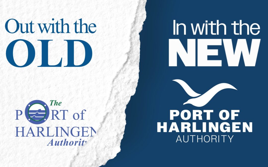
HARLINGEN, TX – The Port of Harlingen Authority is going to look a bit different in 2024 with the launch of its rebranding. For more than 30 years the face of the Port has been our Venice blue and white porthole with three waves, accompanied with complimentary color palette of aqua deep (dark green) and Gossamer (light green). Since the 1990s the Port has changed, and its image will now reflect what the growing Port has become.
“The Port has changed so much since we last changed our logo,” Port Director Walker Smith said. “We look different from our footprint, facilities, tenants, modalities, our annual tonnage and even our mission; it was time our outward face reflected who we have become.”
Since the 1990s the Port has increased land size to more than 2,800 acres; rehabilitated existing infrastructure, and built new docks, expanded the number of tenants and commodity diversification, as well as increased connectivity to and from the Port via road, rail and the shipping channel. Since 2009 alone, the Port has increased barge tonnage by 565% and total multimodal tonnage by 239%. As one of the top 150 ports in the United States, it was time to adapt its look.
“While the Port of Harlingen has transformed dramatically over the last few decades, the outward image of the Port has not evolved at the same pace as operations and business,” Port Commission Chairman Alan Johnson said. “Our rebranding and new look now accurately reflects the Port inside and out. As our size and mission changed over the years with meticulous strategic planning and work, our new brand elements now actually tell the story of what The Port of Harlingen is, a growing economic driver for our region.”
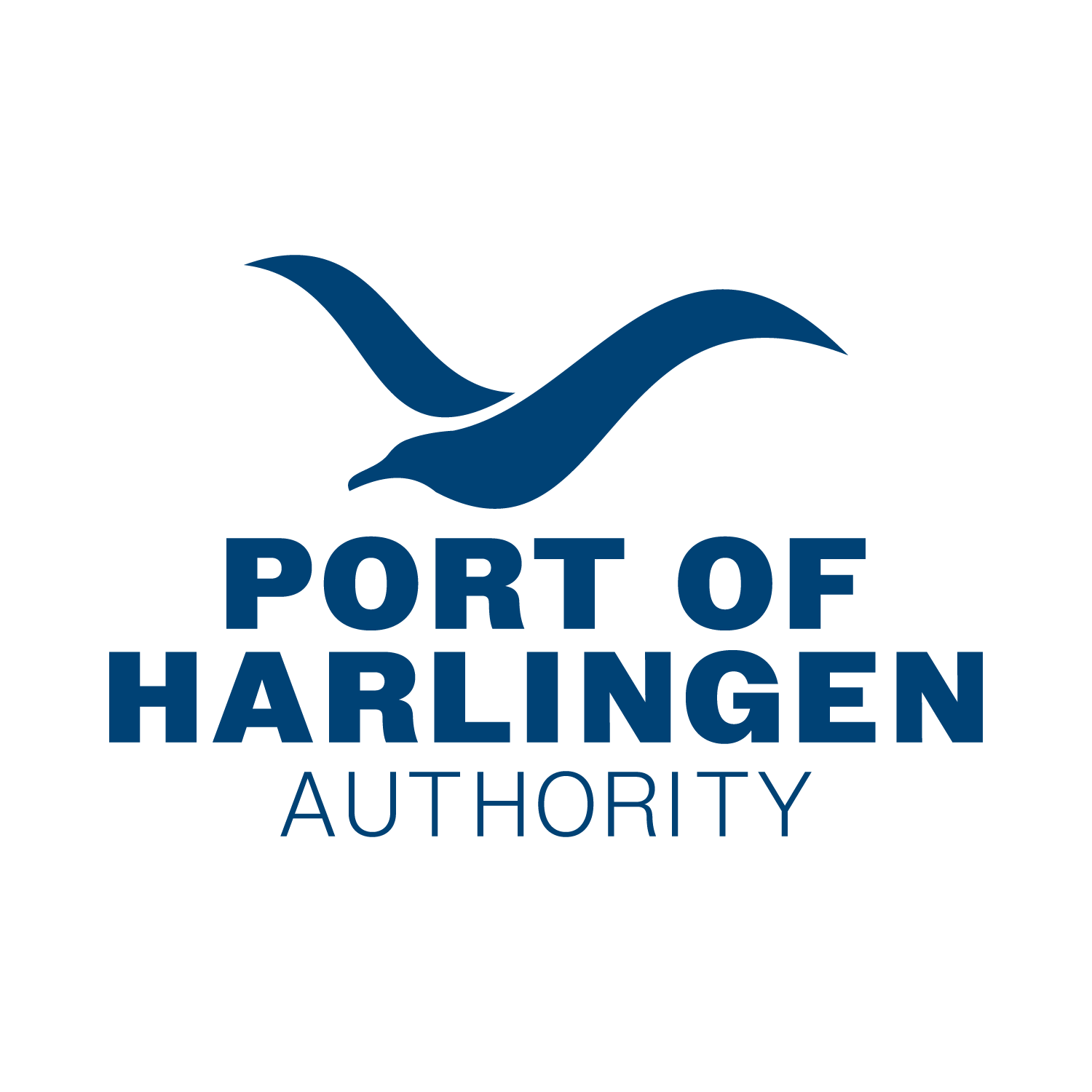
The new face of the Port of Harlingen, produced by Jaclyn Buelow, owner of Jaclyn Buelow Creative, features a seagull, a Port mainstay, that interweaves the legacy of the waves form our former logo. Pulling from the concept of our branding from the Port itself, the extended color palette includes six colors that are a part of life at the Port; POH Blue, Charcoal, Cadet Grey, Earth Yellow, Fire Brick, Olivine, Walnut and Black.
“The new logo concept was inspired by the seagulls that fly nice and high – day in and day out – overseeing the Port’s daily operations by constantly moving with purpose, curiosity and perseverance, serving as a symbol of opportunity and growth, and of course also inspired by the waves themselves,” Buelow said. “We named this concept the ‘Statement Piece’ in the initial round, and the new logo is just that – a statement. Less is more and this prestige abstract image is bold, modern and clean and definitely holds its own- just like the Port of Harlingen. It forms an interesting and powerful identity mark that is not only striking, but sparks curiosity through the mark’s interweaving of seagull and wave all in one illustration.”
“The symbol is accompanied with a brand name that has a bold typeface showing a strong and important presence much like the Port itself,” she said. “Our new extensive color palette was drawn from the colors we pulled directly from our surroundings. Each color is something you will find on-site and will offer complimentary colors to allow for more creativity in marketing and branding.”
New brand elements including logo and colors will be effective immediately online and on social media with a slow rollout on printed material and physical signage as necessary.
For more information, go to our online branding guide at Port Brand Guide – Port of Harlingen Authority
Media Contact: Amy Lynch, Director of Public Relations and Marketing, at (956) 423-0283 or at amy@portofharlingen.com.
Recent Comments